 By
·
3 minute read
By
·
3 minute read
An accessible typeface maximizes readability for everyone, especially in difficult conditions.
An accessible typeface is based on several essential criteria: clarity of shapes, clear differentiation of similar glyphs, and good behavior both on screen and in print.
Key aspects to keep in mind
- Internal contrast and open shapes: Generous counters, wide apertures (e, a, s), and strokes that are neither too thin nor too condensed improve reading at small sizes and on a variety of screens.
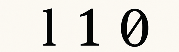
- Differentiation of glyphs: Clearly distinguish I/l/1, O/0, a/g, p/q, b/d. Variants of “l” (lowercase L) with a serif, a “1” (digit one) with a serif or hook, and a “0” (digit zero) with a bar or dot reduce confusion.
- Spacing and metrics: Sufficient letterspacing and line spacing, balanced proportions, and a generous x‑height increase readability without causing “collisions” between letters.
- Consistency and stylistic simplicity:
- Avoid flourishes, excessive decorative ligatures, or extreme contrast;
- Favor regular, stable styles and familiar shapes.
- Readability in multiple environments: Sharp rendering with screen hinting/optimization, accessible sizes, weight/italic variants with sufficient contrast, and good performance both in long text and in interfaces.
- Character and symbol support:
- Extensive Unicode coverage, clear glyphs for mathematical, monetary, and punctuation signs;
- Proper quotation marks and apostrophes;
- Well‑proportioned diacritics for languages with accents.
- Digital accessibility: Maintain visual distinction when color contrast is reduced; avoid long passages in all caps; ensure italics remain readable; provide a monospaced style when precise alignment is required.
- Readable figures: Lining or tabular figures for interfaces and tables; clear differentiation of 3/8, 5/6, 2/7.
- Variants and uses:
- For interfaces and documentation, favor well‑spaced humanist or grotesque sans‑serifs;
- For long printed texts, serif faces with good x‑height and controlled spacing. The choice depends on the context of use, not just on style.
Typeface validation tool
We used the typeface validation tool created by Estée Desanctis to test some common fonts such as Arial and Verdana.
The tool highlights mirrored effects, 180° rotations, and the superimposition of similar characters in order to enable visual validation and clearly determine whether the test is conclusive or not.
Let’s start with Arial:
-
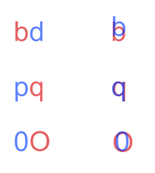
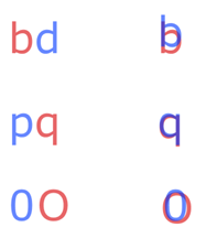
Mirrored characters are indistinguishable for the letter pairs b–d and p–q, whereas there is a small distinction between the capital letter O and the digit 0.
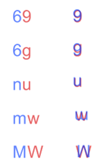
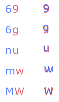
- Characters that are similar in rotation are identical for the combinations 6–9 and n–u and almost identical for 6–g, m–w in lowercase, and MW in uppercase. Characters that look alike when rotated become identical for the pairs 6–9 and n–u, and slightly different for 6–g, m–w in lowercase, as well as M–W in uppercase.
-
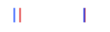
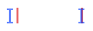
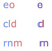
Finally, the last tests — those using superimposition — are often the most revealing. In some cases, characters become completely confused when superimposed, notably I (capital i) and l (lowercase L). Conversely, for the pairs e–o, cl–d and rn–m, superimposition creates only partial confusion

Now let's test Verdana:
- Mirrored characters are indistinguishable for the letter pair b–d, whereas there is a small distinction between p–q and between the capital letter O and the digit 0.
- Characters that are similar in rotation are identical for the combinations 6–9 and n–u and almost identical for 6–g, m–w in lowercase and MW in uppercase. Characters that look alike when rotated become identical for the pairs 6–9 and n–u, and slightly different for 6–g, m–w in lowercase, as well as M–W in uppercase.
- Finally, the last tests show that in most cases, characters — in particular I (capital i) and l (lowercase L), as well as the pairs e–o, cl–d and rn–m — remain different enough not to completely merge when superimposed.
It is clear that Arial and Verdana do not meet all of these criteria. Even though they are often presented as accessible — and sometimes recommended in official government documents — these typefaces lack certain crucial details that truly improve readability. Verdana does offer better differentiation of certain characters than Arial, but still does not fully meet the strictest typographic requirements. Fortunately, there are better alternatives.
Suggested accessible typefacesSuggestion de police de caractère accessible
No typeface is perfect. The strengths of a given typeface may not suit all contexts or all readers. That said, here are some typefaces that meet the largest possible number of criteria:
- Atkinsons Hyperlegible (https://www.brailleinstitute.org/freefont/)
- Luciole (https://www.luciole-vision.com/)
In practice, testing a typeface with users, at different sizes, contrasts, and text lengths, and checking the clarity of ambiguous pairs is just as important as its technical specifications.
To go further
Interested in pushing accessibility in your digital platforms and documents? Tell us about your project or browse our catalog of training courses on digital accessibility.